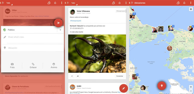
We have seen several Google App refreshes, revealing Google’s work to spruce up the design behind several of its Android apps. First we saw a new Gmail, then Calendar, and finally a home screen that sported new icon designs. Whether or not any of this is tied to those Project Hera rumors is anyone’s guess, but evidence of the overhaul continues today, as we get to check out some leaked screenshots of the Android Google+ app.
Those circular icons are back in a big way (just like the circular g+ icon from that home screen leak), and we see the recurring design choice of using bold stripes of color up top. The source behind these pics notes that he regrets being forbidden to share the APK itself, but it sure feels legit enough – the tweaks here are absolutely in line with those we’ve seen earlier this month. As far as other changes go, we also see the transition to a windowed view for composing new posts, rather than a fully separate screen.
This is what was leaked,
All of this has us wondering if Google might be planning some grand reveal for these newly refreshed apps: a bold new look for Android, if you will. With all the similarities we’re spotting releasing piecemeal updates might be a wasted opportunity, and Google could want to capture as much attention as possible when it formally reveals this new look. That is, of course, assuming it goes through with what we’ve been seeing, but we’re guessing that this is very much where Google is headed. We’ve heard that I/O this year could be big on design, so maybe that’s where Google is hoping to talk about this new look.
What do you think about this new Leak? Are you Impressed?
Source – Yoel Kaseb


