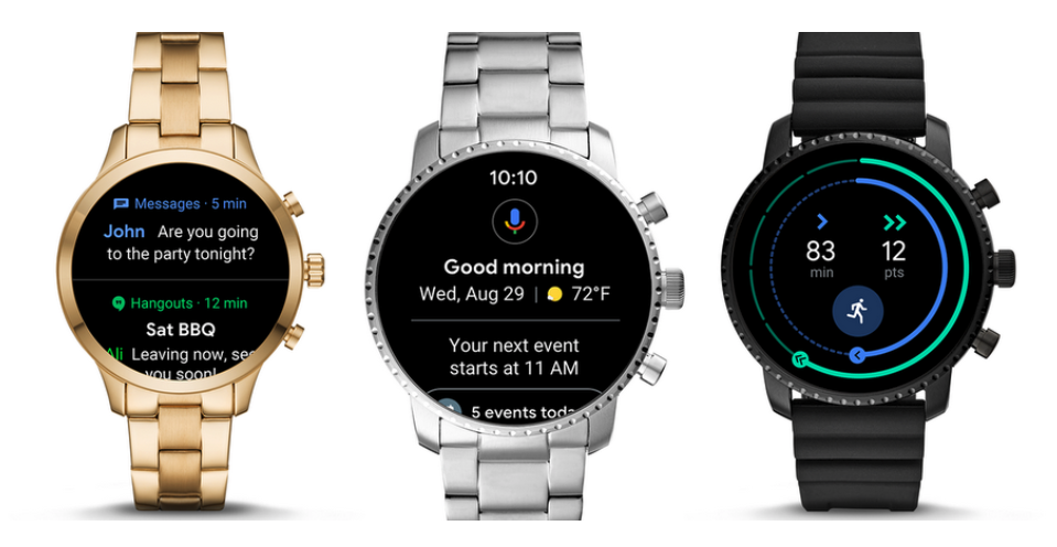
Google just announced a major re-design of its Wear OS in a blog post. Google is focusing on usability and adding in new Google Health features while making it easier to access the Google Assistant.

Better notification management
Firstly, the notification menu is easier to navigate, more compact and adds a few nifty shortcuts. For example, a simple swipe up will display all of your notifications and a smart reply is just a tap away. This won’t even make you leave your notification stream. By swiping down, you can now access more shortcuts like Google Pay and the “Find my phone” functionality.
Easier access to the Google Assistant
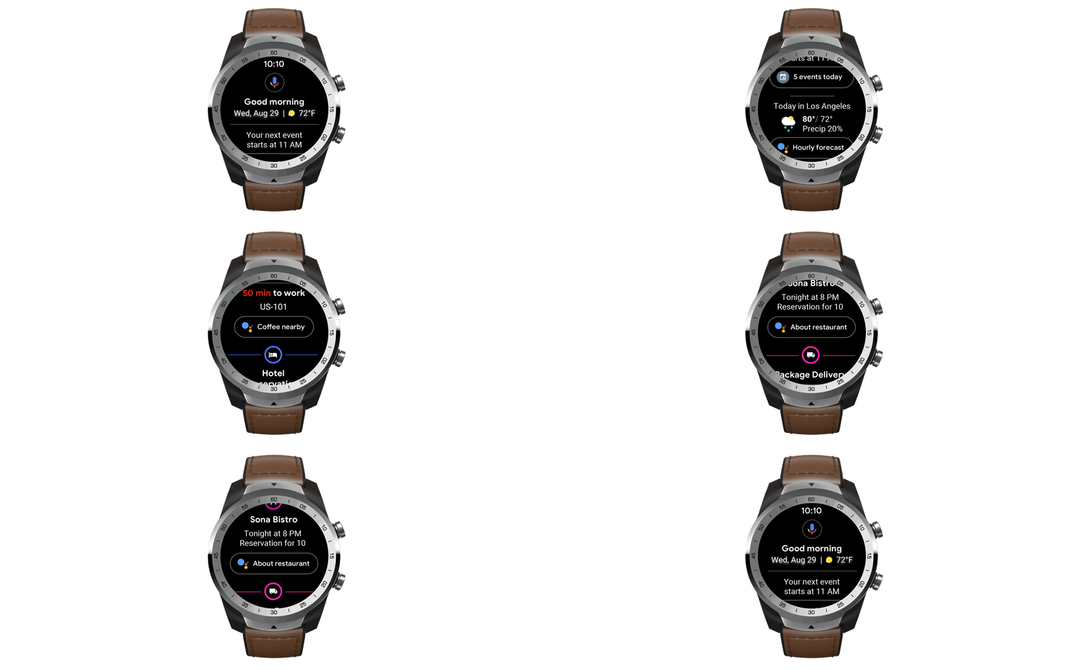
Google Assistant gets smarter and more contextual. It can bring up important information regarding your trip like hotel reservations, flight schedule or what the weather is going to be like. It will warn you if you need to take an umbrella or if there is heavy traffic on the road. It can even suggest nearby restaurants once you arrive at your hotel. The Assistant will get smarter over time and will add more features in the future.
Smarter health
Finally, the Google Health app also gets new features and re-design. The devs have worked closely with the American Heart Association and the World Health Organization to introduce new goals that will help you stay in shape. The goals are, of course, based on both organizations’ daily activity recommendations and are called Heart Points and Move Minutes. The Health app can be accessed by simply swiping from the right.
All the changes are expected to be pushed next month – probably just in time for the launch of the new Pixel Watch?
Google also noted that some features may vary by phone OS, watch or country.
What do you think about this new design?
Source – Google
