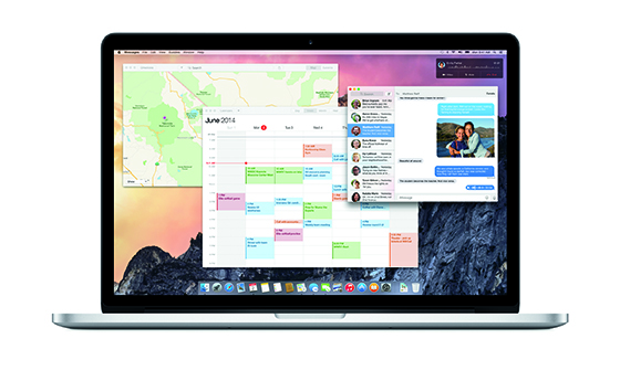
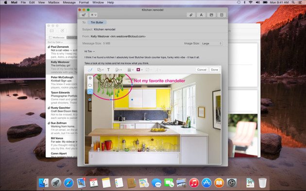
WWDC is happening as we speak (June 2-6) and at their Keynote, Apple launched the latest version of it’s Desktop OS; OS X Yosemite. Yosemite brings a Brand New look to the Mac and it has a whole bunch of useful features as well as the Mac/ iOS integration to some extent. Tim Cook promised both systems to be “engineered to work seamlessly together.”
Craig Federighi, SVP of software engineering at Apple, explained that Apple’s focus for OS X Yosemite was on clarity, continuity and clear font type throughout the operating system, just minutes after unveiling the name.
Finder window menus are now translucent, matching up with the image backgrounds on your desktop to dynamically shift just like iOS does now. On OS X Yosemite, Apple also showed off some amazing looking icons that match the current iOS look. They are Flatter and detailed, and as Craig was like, “You wouldn’t believe how long we took to design a Trash can”. He then went on to call the new overhaul, “fundamentally still Mac.” The new OS also has a new Dark Mode where users will have darker looking colours along with the transparency.

Notification center has also got the iOS style look with the calendar and and notifications from other apps also coming along not only in the old banner way, but also as widgets like on iOS 8. It is completely upto developers to implement this feature.
Another interesting and useful feature to be included in the Mac is the addition of Spotlight search. This will be right in the middle at the center and it looks and performs like Google search on Android, where you can easily search for anything and get a quick answer or a web search result. This new Spotlight can even be used to bring up full contacts info and any related information. Apple has also included this in the redesigned Safari to give users a one-stop place for search across the web and local files.
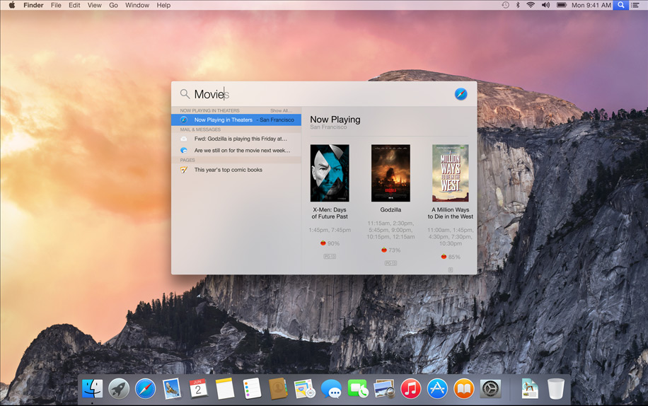

We clearly see how Apple is trying to get to the level of Google Search with recommendations for movie times, nearby restaurants and even offer measurement conversions. This is good news, but apple needs to work on it continuously to get it to be stronger.
Apple also redesigned Safari, and now the newly updated browser is also having the iOS style look like all the other System Apps. On the redesigned Safari, Favorites are now hidden by default, but users can access these by clicking on the address bar. Sharing out links to social networks has been simplified with a one-click process and RSS feeds will populate in the browser’s sidebar. It has also got a redesigned Tab Window Switcher, where you can easily switch between tabs.
AirDrop is one of those things that got a Big pop at the event. It is mainly because of the integration. Yosemite now works with iOS, so iPhone owners can easily transfer files to the Mac and back. OS X Yosemite has also gained the ability to recognize work being done on iOS that a user might want to continue on the desktop. The feature works very simply: Once an action is detected on iOS, Yosemite will create an icon on the desktop to remind the user to complete the task. This sensing ability also extends to creating a tethered connection, as a user’s iPhone will now appear as a connection option in the WiFi drop-down. Craig Federighi demoed the calling by ignoring his mother’s call and then calling new Apple employee, Dr. Dre. The OS will even allow users to click on a number within a website (say from a restaurant page) to dial it directly.
Apple is making OS X Yosemite available as a preview for the developers beginning today, with a non-dev beta to be released this summer. But, as it was with OS X Mavericks, today’s Yosemite reveal is only a teaser for the Apple user public-at-large and that full retail release won’t be available until sometime this fall. Though, when Apple does unleash OS X Yosemite later this year, users will be able to download it for 100% free which is the best news for Mac Users.
So what do you think? Are you happy with Yosemite? Drop a comment down below and stay tuned to Andro Dollar for more.
