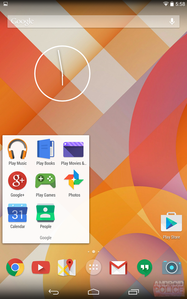
UPDATE : A newly-leaked screenshot of an upcoming Android software version, Android 4.5 – codenamed “Moonshine” – offers a glimpse of what’s coming.
Androids design guidelines include a very specific set of instructions regarding icon design- it should have a unique silhouette, it should have a slight downward perspective, and it should be clearly visible no matter what wallpaper is behind it.
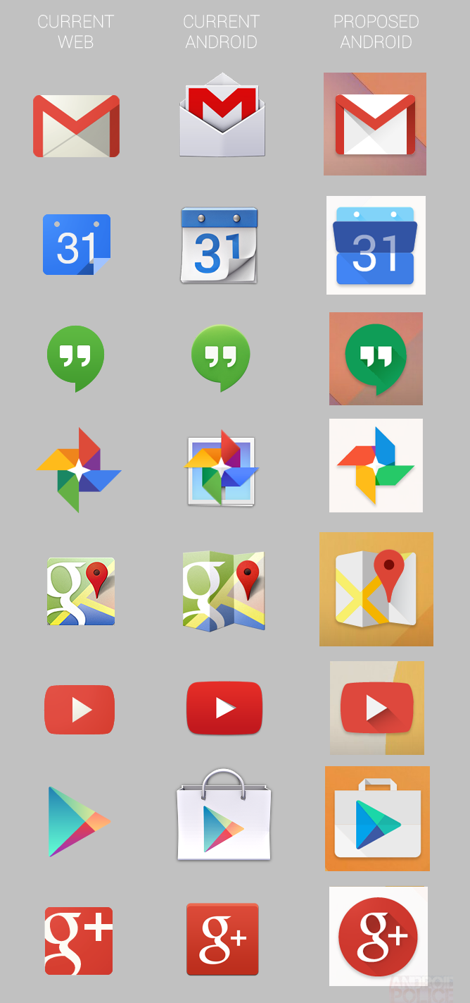
Many people say that its unusual that Google maintains different iconography for its apps on Android and their corresponding web services.

It may make sense to maintain a difference between them but if the rumor is true, the icons are going to be taking a few styling cues from their web counterparts.
This new style, internally referred to as “Moonshine” would see Android icons take on a somewhat flatter appearance, with long, hard shadows behind prominent elements, reminiscent of what can be seen in Google’s existing visual asset guidelines.
The good thing here is that they are very different from the web icon and could be a reality very soon.
The below screenshot of a Google Partners page (access code required) shows what appear to be the Calendar, YouTube, and Maps icons we see above. This cannot confirm that the icons will be coming to Android, but does suggest that they are real, and could well appear elsewhere.
If this rumour becomes a reality we might see some changes to the Guidelines set by Android and it would be interesting to see a flatter aesthetic outlook, more in line with the simplified, distilled nature of Google’s current web icons.
Source – Android Police
