Apple and Google attempt to outdo each other every year when they refresh their iOS and Android mobile operating systems. This year has proved no different with the arrival of iOS 7 and Android 4.4 Kitkat. iOS 7 was released on the 18th of September 2013 and Android 4.4 Kitkat was released along with the New Nexus 5 on the 31st of October.
Lockscreen
Android 4.4
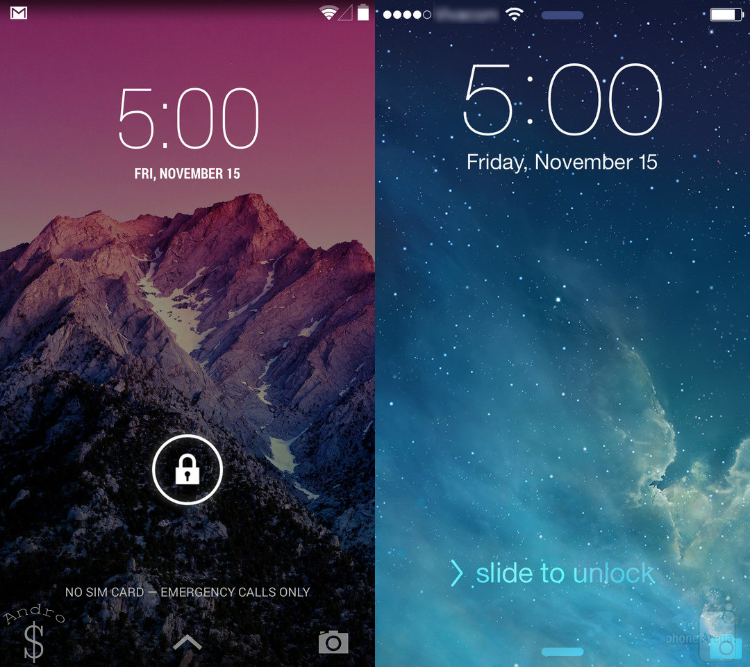
On Android 4.4, Google have implemented the same design as Android 4.3 with lock screen widgets and Right swipe to open the camera. This time they have added an camera icon on to the bottom of the right hand side and also allows users to open Notifications or show the hidden System Menu Tray (Back, Home, Recent Apps)
On Android the Main advantage they have is having Lock screen notifications which make life so simple. However it must be noted that Lockscreen notifications don’t work on a device with a Locked Password/Pattern.
iOS 7
On iOS 7, Apple has gone the extra mile to redesign the lock screen and make that also transparent and colorful. Apple have also allowed the users to access notifications/Control center from the Lockscreen.
Interface
Android 4.4
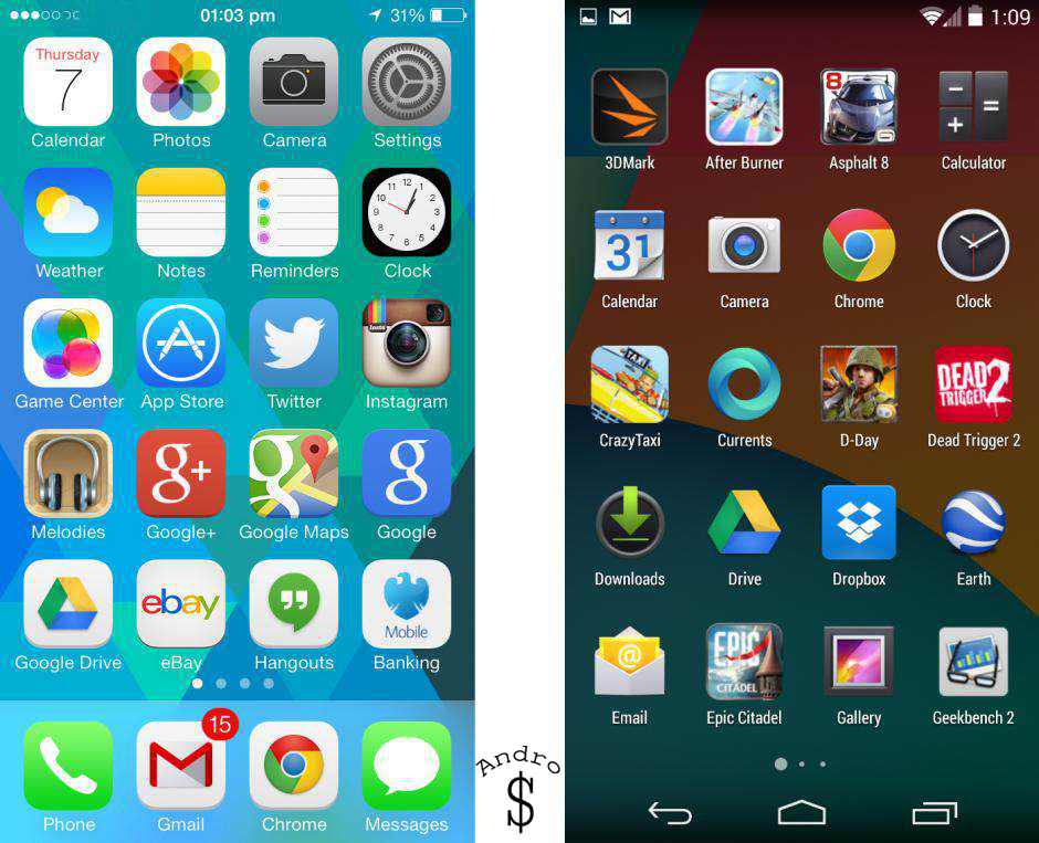
Android 4.4 is more evolution than revolution. Visually, it’s a very close match to 4.3, with the biggest aesthetic alterations being a slightly revised “Roboto” font and removal of the solid bar that surrounds the notification area at the top of the screen and the Android command bar at the bottom of the display. Google have also implemented a Whitish Color as the system color instead of the Blue they had previously.
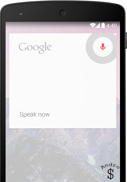
Then comes the New “Google Experience Launcher” which makes Android look much cleaner and cooler than its competition. The app drawer no longer has the black background, it is now transparent and also the Widgets section has been removed from the app drawer. Google Now is also more integrated in to the system now. The Google Experience launcher takes full use of this and when the user slides to the left he can see the Google Now Page. Also the launcher detects voice commands and it is programmed to respond to the key word “OK GOOGLE” When the user says “OK GOOGLE” on the Main Home Screen, the phone wakes and waits for us to command it.
On Kitkat, The new Hangouts app replaces the old Messaging text app, but it feels rushed. The cluttered interface can be confusing and the app doesn’t thread SMS and Google Hangout messages from the same contact together (YET). It can be replaced with an SMS app of your own choice since android is open source.
Kitkat’s autocorrect feature is more convenient to use than iOS’. Placing the text caret in a word brings up a bar just above the keyboard with autocorrect suggestions. This is easier to reach than the bubbles that pop up above the word in iOS.
On android users can enjoy Live Wallpapers (Animated Wallpapers) and some apps like Multi Picture live wallpaper takes use of this to make some awesome wallpaper.
iOS 7
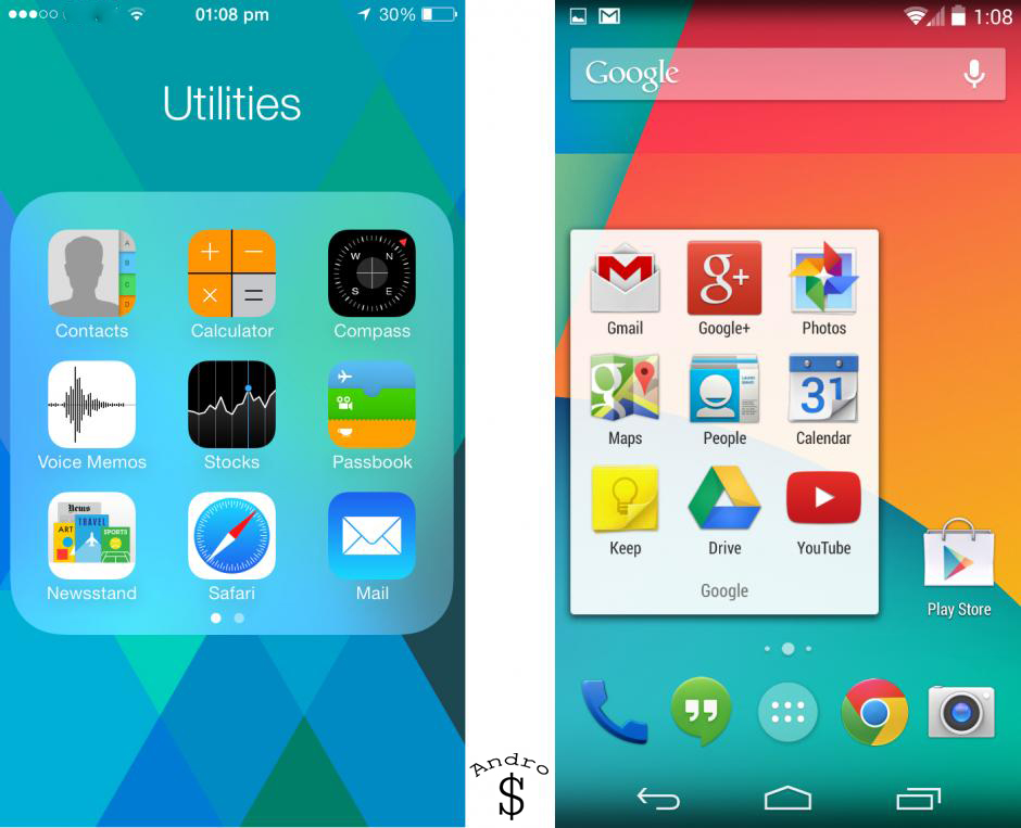
Apple redesigned the interface for iOS 7(Finally). The glossy icons and cluttered looking built-in apps have been replaced with simple, colorful icons and minimalist designs.
For example, the Notes app no longer looks like a virtual notepad with lined paper – it’s just black text on white, although the notes do have a subtle paper-like look to them. This doesn’t mean there’s no visual flourish – iOS 7 uses more translucency and animations.
Most changes to iOS 7 are cosmetic and the OS is as easy to use as ever. If you find animations too distracting, they can be Switched Off (But it is still not as smooth). The font is thinner and lighter than before which some will find hard to read. An option to bold text in the Settings app compensates for this.
Apple has added a ‘Control Centre’, which contains shortcuts to commonly used features such as Wi-Fi, volume, Music player, Flashlight and the camera app. This is brought up by swiping upwards from the bottom of the screen.
Spotlight search has also been changed. Earlier on iOS 6 and below user had to swipe left to reveal the spotlight search. But now they can reveal it just by pulling down on the home screen just below the notification bar.
Folders have got a big upgrade on iOS 7. Now users can have Unlimited Icons inside folders. Organization has been a ease because of that.
On iOS 7, another new thing is Dynamic wallpapers. These are like Animated wallpapers. For now users can only use the ones provided by apple.
Notifications
Android 4.4
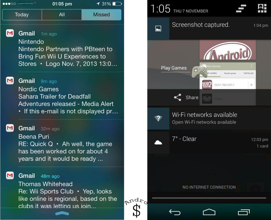
Android has been ahead of the game when it comes to notifications for quite some time now, and while there are no massive changes in 4.4, it’s still streets ahead of iOS. On Android, your notifications are displayed in a pull down menu, but you can swipe away ones you don’t wish to read, and expand some – such as emails – to gain a better preview of their contents before actually opening and responding. The android OS also allows other third party applications to take use of the notification panel (Eg-Battery Widget Reborn has a very nice battery Widget Graph). By clicking on the button on the top right corner next to the setting button revels all quick toggles (This can also be done by swiping down from top with 2 fingers)
iOS 7
Apple has made massive improvements to the notification panel by adding categories now. You can select how apps fire notifications – a banner or an alert – and have them appear in a special pull-down notifications panel, as well as on your lock screen. However, you have less control over notifications than in Android (On android, if the user wants to make it work like iOS, he can up to some extent by installing 3rd party apps).
Multitasking
Android 4.4
Multitasking in Android 4.4 is very much the same as before and is accessed by tapping the multitasking button. From here you can shut down applications by swiping them out of the application stack.
iOS 7
iOS 7 introduced a multitasking menu which was an almost direct imitation of the one used in Android, right down to using the same swipe gesture to dismiss apps. Inside, however, the core functionality is rather different. While apps in Android can continue to run in the background, in iOS most – but not all – applications are placed in a “frozen” state, which means they don’t consume processing power but can be quickly restarted at a moment’s notice. The advantage here is that battery life is conserved, but it means apps have to be specially coded to perform background tasks. The new iOS update of Google’s Google+ app is a good example – it will soon be able to upload photos to the cloud even when it’s not actually open.
System Applications
Android 4.4
If you’re a dedicated user of Google Mail then you may want to consider picking Android, because like so many of Google’s apps the service integrates so much better. Other included apps such as Google Maps, Wallet(On supported Devices), YouTube, Drive, Quick Office, etc. perform great.
iOS 7
On iOS 7, just like on iOS 6 Apple includes Most of its apps such as Compass, Stocks, Passbook, Newsstand, etc. and they are all redesigned and work great.
Sharing
Android 4.4
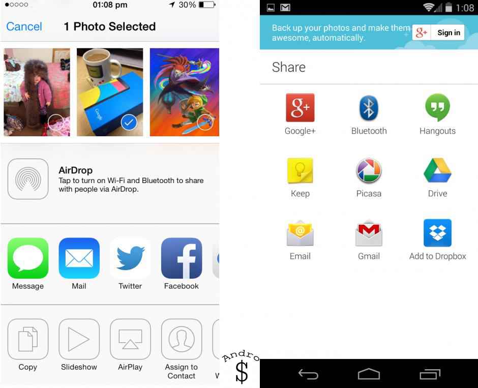
This is another area where Android is king. You can share things in Android between a whole host of applications. As always android lets users share via 3rd party software’s. Just like sharing it allows other apps use features. One good example will be when someone wants to set his profile picture he can either use a photo on his device or Directly select from Google Drive/Dropbox or other service the user is using. On iOS this is not possible.
iOS 7
Apple has definitely improved sharing a bit more on iOS 7 but it’s not on Par with Android. iOS 7 gives the users to share on Facebook, twitter without any hazel. But if he needs to share on Google+, then he would have to copy the link, open the Google+ app and then share. This involves too many steps.
Voice Assistants
Android 4.4
Google Now recognizes what you say quicker than Siri but needs commands to be specific like,
- “Open [name of app]”
- “Create a calendar event”
- “Listen to TV”
- “Map of [name of place] “
- “Directions to” or “Navigate to”
- “Post to Google+ [message]”
- “What’s this song?”
- “Scan a barcode”
- “Go to [URL]”
- “Send email”
- “Note to self”
- “Set alarm”
- “Listen to [name of song]”
Where Google Now excels is in its pre-active approach. Walk near a bus stop or Tube station and Google Now will automatically list the departure times from the station or stop. If you have an email with a flight itinerary in your Gmail account or an appointment in your Google Calendar, a reminder about your flight or meeting will appear. Google Now will also list nearby sandwich shops at lunchtime and nearby restaurants in the evening. Google Now is designed to integrate with other Google products such as the Calendar and Gmail. If you use an Exchange-based calendar and email account then Google Now won’t be able to access your appointments and emails.
The Google Now interface is accessed by tapping and holding the home button and then swiping up. Nexus 5 users can access Google Now by the more convenient shortcut of swiping to the left from the first home screen. The ability to trigger voice commands hands-free by saying ‘OK Google’ when you’re at the home screen is limited to Nexus 5 users in the US. According to Google, a wider roll-out is dependent on how popular these features are. Google Now would be even more useful if it could be accessed from the lock screen.
iOS 7
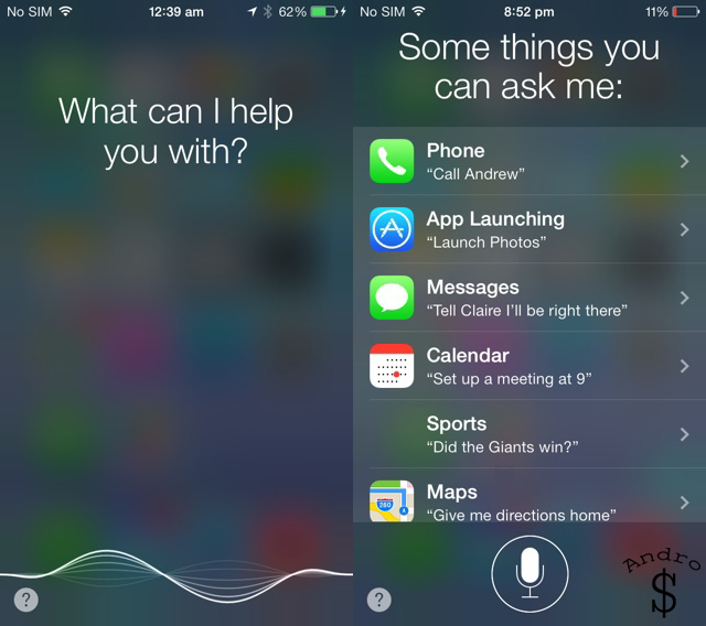
Siri is reactive, so you need to ask it questions to perform tasks. You can ask the assistant pretty much anything such as “what’s the meaning of life?” and you’ll get a response. It’s possible to ask Siri to,
- Dial phone numbers
- Dictate and send texts, tweets and emails
- Find out info about contacts – age, phone number, address
- Launch apps
- Create calendar entries and reminders
- Post to Facebook, Twitter
- Get directions from Apple Maps,
- Control music playback,
- Control Wi-Fi, Bluetooth, Brightness, Airplane mode
- Search Yahoo, Google, Wolfram Alpha
- Ask about sports, restaurants, movies
The accuracy of Siri’s voice recognition isn’t perfect, but gets better the more you use it and the clear enunciation helps. Siri is also cloud-dependent, so it works best on a fast and reliable Wi-Fi connection and will be slower when using mobile networks.
Siri integrates with iCloud-enabled apps. Set a reminder via Siri on your iPhone for example and it will also show up in your iCloud-enabled reminder apps on your iPad and Mac.
Conclusion
When Apple updated iOS, it polarized a lot of users. Some didn’t like the cartoon-like visual style and the various changes made under the hood. You either love it or hate it. The other problem with iOS 7 is the App Crashing. The Apps crash a lot more on iOS 7 compared to iOS 6. The new iPhone 5S can’t take full advantage of this (YET). However with future updates apple will try to fix it. iOS 7.1 has already been released to developers as a beta. So we have to wait and see what Apple will do to solve the problems of Crashing and other minor tweaks.
Android 4.4 adds in some new features, such as cloud printing and massive optimizations, which allow it to run on phones with as little RAM as 512MB, but on the surface, a layperson may be hard pressed to tell the difference between 4.3 and 4.4. A lot of the effort gone into creating 4.4 will no doubt occur out of sight, it runs smooth as silk on the Nexus 5, which will come as no great shock but when we see it trickle down to older, less capable devices, then we will surely see how much of an improvement it is over 4.3.
Android has the upper hand here due to the number of devices and form factors it’s available in. If you want a 4” device you can have it. If you want a 5” device you can have it (Galaxy S4, Nexus 5, and Xperia Z1). If you want something bigger even you can have it (Note 3, Xperia Z Ultra, HTC One Max). With the device the specs also change and the experience also change according to the custom theme the companies are using. Samsung uses Touchwiz, HTC uses Sense, Sony uses Timescape aka Xperia UI. If the user is not satisfied with that he can just root his phone and install a custom rom like CyanogenMod or Paranoid Android with more advanced but cool features. But not everyone c=is willing to try custom roms or root as it involves a risk.
iOS is great for a normal person to enjoy the Great App selection (There are also Music, Movies and Books) and User Friendly OS. But Android is made for a more advanced person. It is made for a person who wants more from their device. Now phones are filled with raw power. One could argue that with an Android phone (Good one like the Note 3) he can survive without a PC; and that is true. Just connect a OTG cable dock it and connect the Mouse and Keyboard. To get a better feel connect the phone to the TV with a HDMI cable or over WiFi. That just made it a PC. It won’t run Windows Software but it truly is amazing how far we have come. Because of Apps like Google Quick Office users can easily edit Word Documents on the go without any hazel. This makes android better.
Right now, the fall of 2013 if you are in the market for a device, and if you want something really good and if you want something that can do more things than a normal phone(Windows/Blackberry) then get an Android Phone or if you just need one well-built phone with a nice looking OS then get the iPhone. The choice is yours – at the end of the day it’s you that’s using the phone; not me. So think twice.
The Clash of the Titans just got a bit more interesting with the launch of iOS 7 and Kitkat. What do you guys think? Which side are you on? iOS or Android ? Drop a comment down below and let us know and take a minute to share the Article if you enjoyed it.
